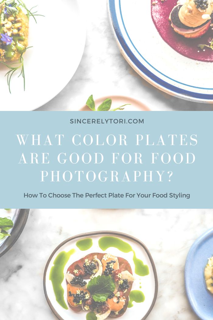
What Color Plates Are Good For Food Photography?
How To Choose The Perfect Plate For Your Food Styling
When it comes to food styling one of the first decisions you’ll need to make is what type of props you use to style your food. Of those props, plates are particularly important in food photography. The dishes you choose can perfectly complement the food you wish to showcase. However, some kinds of dishes can distract from the food subject completely and create cluttered looking images.
What Color Plates Make Food Look Good?
So, what color plate should you choose to create stunning food photos? When taking photos of food it’s best to not use colors at all. Use neutral tones to avoid distracting from the food itself. Think earthy tones like black, brown, tans, and grays. The most tried and true color for food styling are white plates.
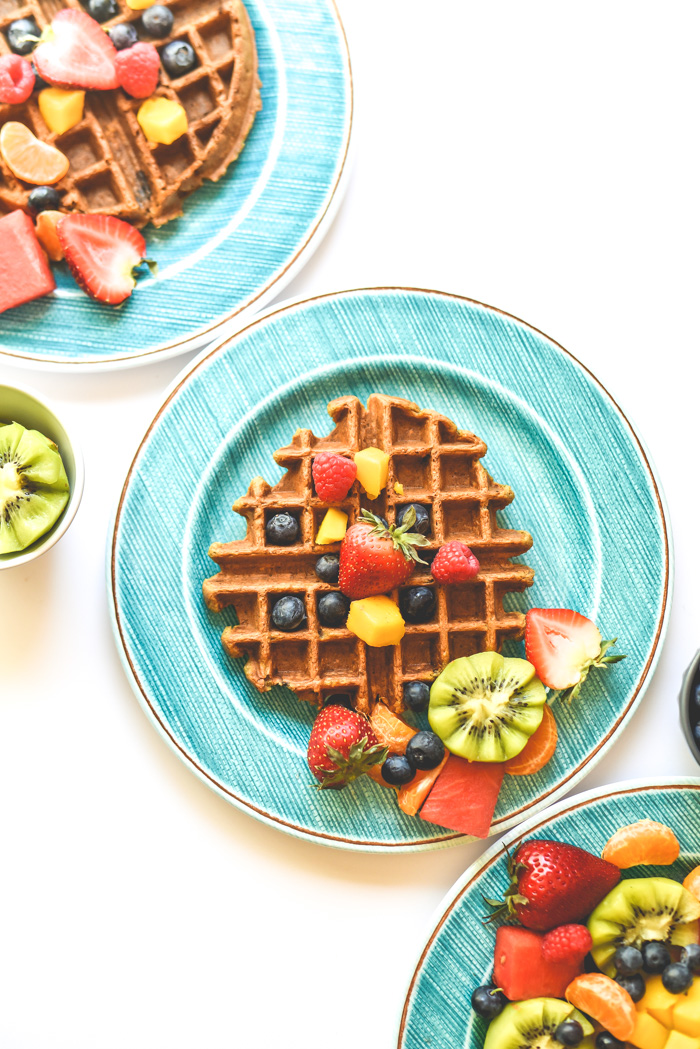
When in doubt, if you are trying to take moody photos go for black or grey plates and go for white if you want clean bright feeling photos. There is a time and place to use colors in in food photos
Tips For Choosing Plates For Food Photography
A perfectly chosen plate can be the difference between good and amazing in your food styling. Here are some tips for choosing the perfect plate.
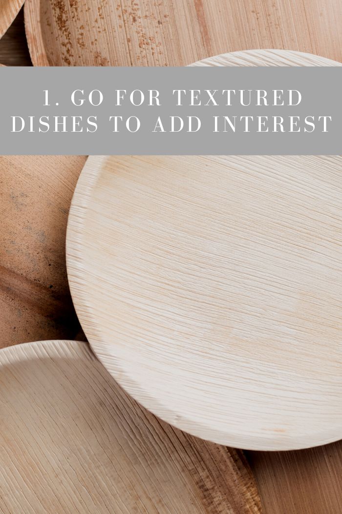
1. Go For Textured Dishes To Add Interest
Bright colors may distract from food but using textured dishes is a great alternative to add a unique look in your food styling. Textures such as stoneware, wood, marble, speckles, clay, and cast iron can set your photos apart. Even the most subtle amounts of texture on your dishes can give depth to a simple scene without distracting from the food.
See this post on food props for ideas on wooden plates and dishes: 25 Wooden Food Photography Props You Can Get Online
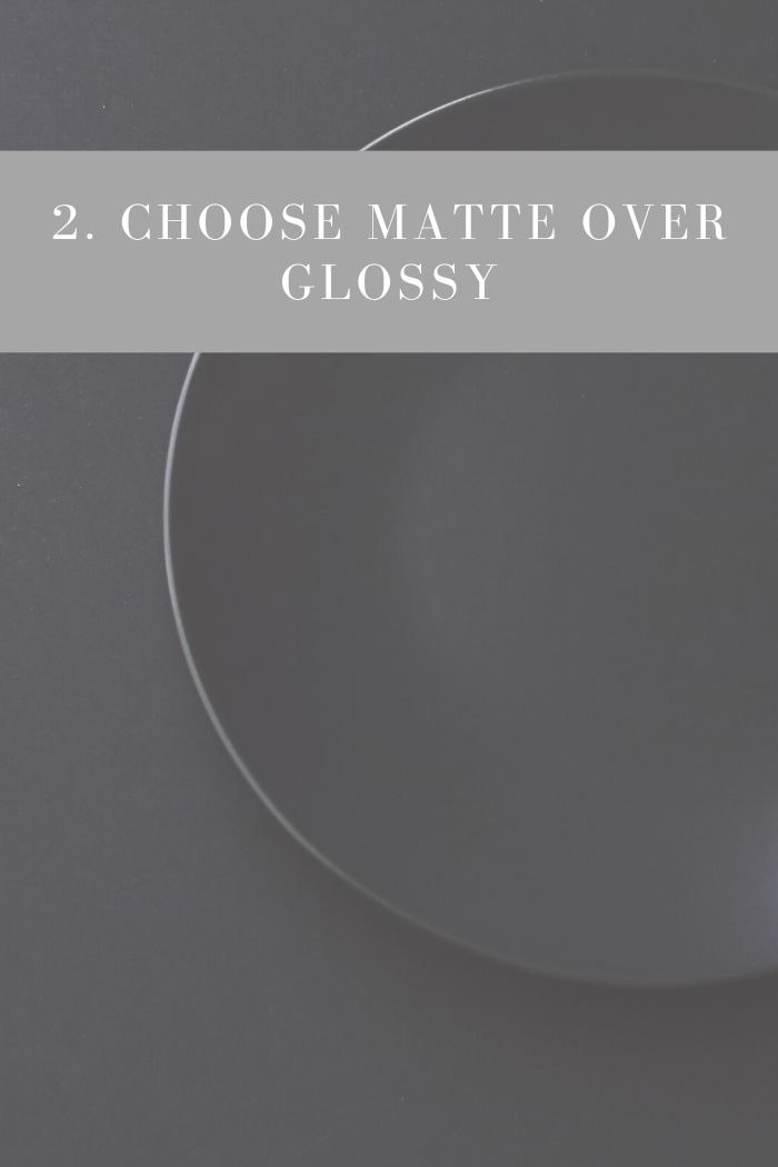
2. Choose Matte Over Glossy
Something to keep in mind when choosing plates for your food photography is to opt for matte finish. Most restaurants and dishware sets have a glossy finish that makes them look pretty in real life but can cause unwanted shine in a food photo.
If you only have the choice of glossy dishes just be aware of the direction of the light. Try to adjust it to minimize highlights hitting the gloss and creating a glare.
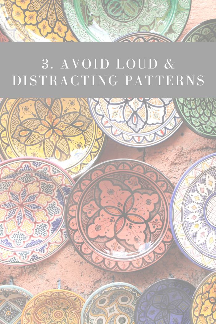
3. Avoid Loud & Distracting Patterns
Also avoid choosing plates with too many patterns, if any at all. Patterns will draw the eye away from the food and create a feeling of chaos in your images. Subtle patterns like floral trim or stripes can look lovely in certain photos, just go easy and be aware of what you want the focus to be.
Geometric designs and heavy floral are beautiful for decorative dishes, but these are probably not going to give you a clean professional look in your food styling.
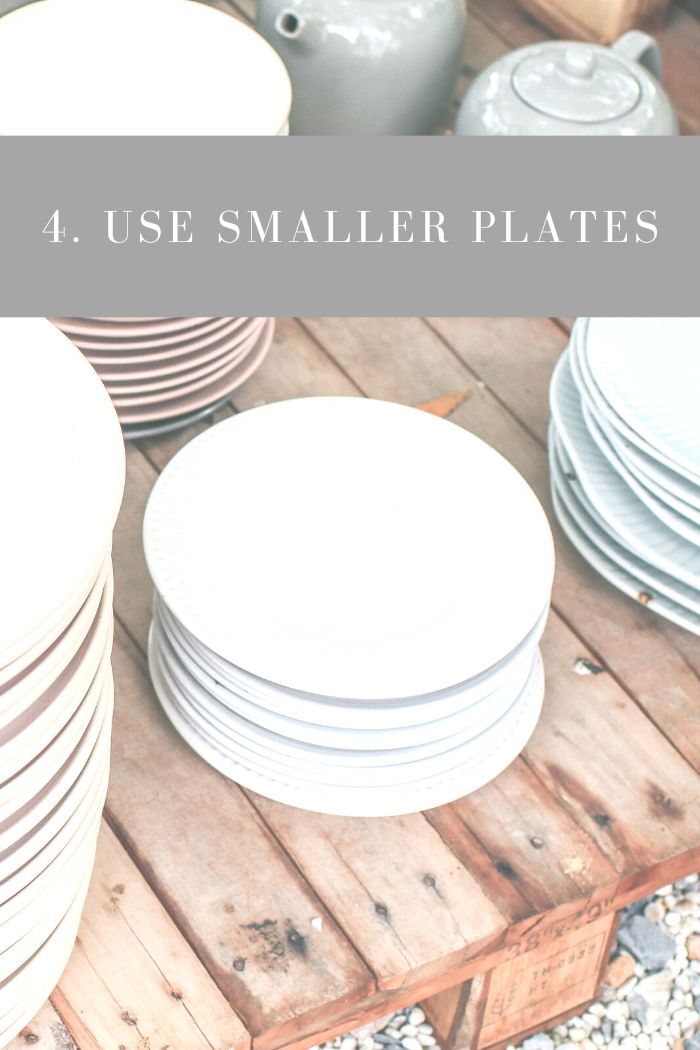
4. Use Small Plates
Bigger isn’t always better in food photography. When taking photos of certain foods you can lose the subject by surrounding it with the empty space of a large plate. Try using a smaller plates to make the food appear larger and be more eye-catching as the star of your scene.
Large plates can be great for stacking underneath smaller plates to make layers in your photo. If you only have a large plate to use for a small food item, use sauces or garnish to fill out the empty space on the plate.
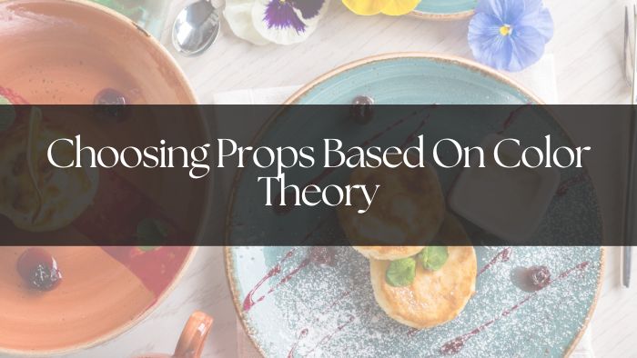
Choosing Props Based On Color Theory
Color theory can be defined in various ways depending on the context. It is an entire subject in and of itself. To put it simply for this context, color theory in photography is the art of choosing complimentary colors based on a wheel of color. Color theory can help determine what colors pair well together to look most appealing.
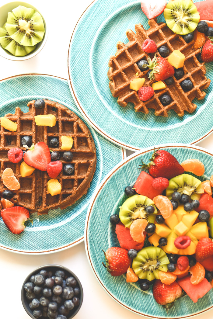
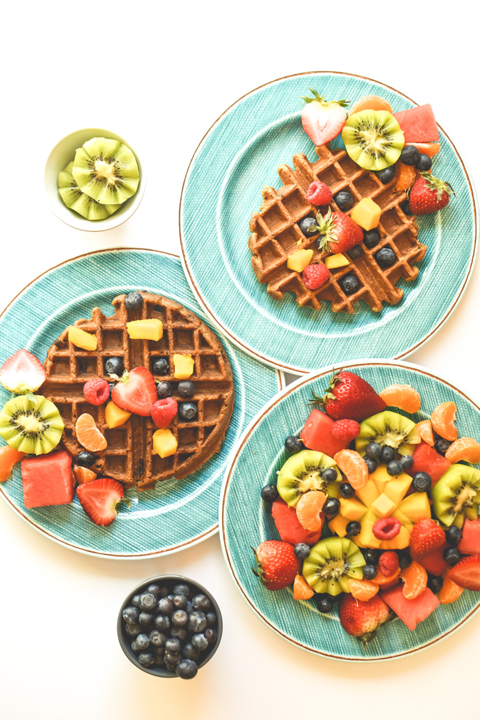
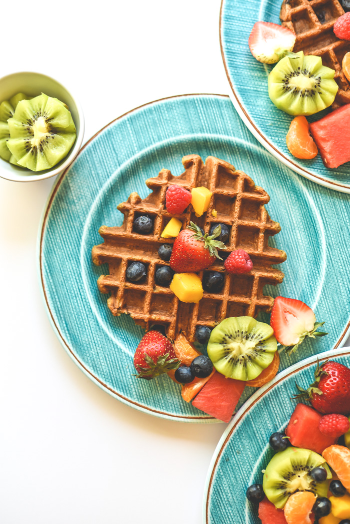
For example, orange and blue are opposites on the color wheel and therefore pair well visually and create contrast. When taking photos of foods in the orange hue you may find it looks nice with blue plates.
While it is often best to avoid colors when choosing a plate for food photography, there are exceptions. Using a tasteful amount or color or patterns, especially when shooting bland looking tan or brown foods, can sometimes be just what a photo needs. As always, keep in mind that art is subjective and there are no definitive right and wrong choices.
How Colors Make Food Look More Appetizing?
Another aspect of colors in food photography, or any art form, is the psychology of colors. Colors can evoke emotions and moods that may help make your food photos stand out. Warm colors such as red and orange promote feelings of excitement and confidence. Blues and greens give the feeling of freshness and serenity.
It may seem like adding colorful dishes is a good way to make your photos more interesting, Instead of using colors in your food photos by adding colorful plates, try and focus on creating colorful food and using less distracting dishes.
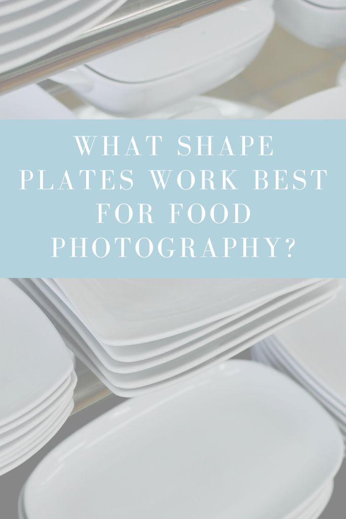
What Shape Plates Work Best For Food Photography?
The shape of your plates can be equally important to the color. If you plan to take photos from a straight on angle (90 degrees) then you’ll want a traditional flat plate so you can have as much of the food visible as possible. If you are taking flat lay shots from above the food you can choose a deep plate.
Deep plates that are somewhere between the shape of a bowl and a plate are also great for styling soups and stews. The shallow depth allows you to show texture while also showing broth or sauce around the dish.
Conclusion:
Everyone has different preferences and opinions for what looks good in art and photography. Food photography is no different and so it is ultimately up to you to choose. The best color plate to use in food photography is going to depend on your personal taste and unique style.
Simple colors are the preferred choice for many food photographers. However, don’t be afraid to experiment with wild colors and patterns to see how much you like to include that in your signature look. Beauty is in the eye of the beholder.